 |
 Join Date: Jul 2006
03-16-2011, 11:04 PM
Join Date: Jul 2006
03-16-2011, 11:04 PM
|
Reply
|
What are all the boards with hidden (and not so hidden) words, meanings, and such in the graphics?
The 2010 Slingshot Response has a hidden bit of random poetry in the pin striping. (sorry the pic quality and lighting is not great, but it still should be readable.


I know a couple of Murray's boards have some kool things on them. i think one year had words in the pin stripes too like slingshot's last year, 2008 Murray i believe?
I really liked the 2006 Murray with the bottom design that read "Murray" one way and "hyperlite" the other
|
|
Join Date: Nov 2002
03-17-2011, 1:36 AM
|
Reply
|
|
I know one of Murrays boards has stuff about his life placed in a map.
There's a lot of boards that'll have signatures or initials hidden in the graphics (if you look hard enough at some of the old hyperlites you'll find "KMCC" wink wink)
And there's some artists that just like to put in extra stuff for people to find (some of which are highly inappropriate). I think its cool to put the extra effort in. I really like a graphic to look like a work of art.
I didn't notice until someone pointed it out, that the graphics on that ss response were a top down view of a buildings plans/blueprints, not a funky cassette tape.
Last edited by kristian; 03-17-2011 at 1:43 AM.
|
|
Join Date: Nov 2008
03-17-2011, 5:17 AM
|
Reply
|
|
Also not so hidden, but some boards make a picture if you line up all the sizes (last year's LF Trip comes to mind).
|
|
Join Date: May 2010
03-17-2011, 11:01 AM
|
Reply
|

watsons goofy face
Last edited by shredthegnar87; 03-17-2011 at 11:02 AM.
Reason: pic didnt show
|
|
Join Date: Apr 2007
03-17-2011, 12:27 PM
|
Reply
|
|
ronix is all about hidden messages.. the bottom of my cells say ron the ninth.
the logo is also one itself. Ron IX makes ron the ninth. The logo also can be seperated into a S and a 1 that represents square one which has something to do with their headquarters in seattle or something i dont know
|
|
Join Date: Aug 2010
03-17-2011, 1:33 PM
|
Reply
|
|
Ronix has a ton of hidden stuff. On almost all their stuff. Ever notice 8:12? Its on alot of things, sometimes hidden and sometimes not so hidden like on the 2011 Ibex. The Viva has had a message writing in Italian on it for a few years now off and on. And if you look at their boots there almost always some type of message or story on the bottom. And what I like about how Ronix does it is how it all will makes sense and goes together if you actually do research and figure out what all of it means. And some of their names are hidden messages on their own. They put alot of thought into all the details of the boards and boots and all comes together. Its nice to see a company with creativity and not just bright colors and messy graphics.
|
|
Join Date: Nov 2002
03-17-2011, 1:40 PM
|
Reply
|
|
Trivia: What does the brail say on the velcro toe strap of the 2010 Bill Boots?
|
|
Join Date: Jun 2004
03-17-2011, 1:56 PM
|
Reply
|
|
Whoever made Murray spell Hyperlite backwards is a genius. That's awesome.
|
|
Join Date: Aug 2010
03-17-2011, 2:14 PM
|
Reply
|
|
I don't know what the toe strap is, but the pull strap says "western loop", theres a trivia question on its own. From what I remember Hyperlite hired a school teacher that did art to draw the Hyperlite/Murray, creative, but that graphic is horrible, sweet mask.
|
|
Join Date: May 2006
03-17-2011, 5:06 PM
|
Reply
|
|
Its an old board but ICONN had a board with a graphic that referenced somones man parts. It was called the ROOSTER.
|
|
Join Date: May 2006
03-17-2011, 5:07 PM
|
Reply
|
This board says 420 in the graphic.

|
|
Join Date: Sep 2010
03-17-2011, 5:46 PM
|
Reply
|
|
Doesn't the velcro strap on the Frank boots say "for ****s and giggles"? There is a hidden message at the bottom of the 2010 Bill board also, made up of different symbols. Pretty funny, actually!
|
|
Join Date: Apr 2008
03-17-2011, 6:16 PM
|
Reply
|

THE 2009 Obrien decade had fun facts pin-striped on the tail of the board. Some of them seemed outrageous that I couldn't believe if they were real
|
|
Join Date: Jul 2004
Location: New England
03-17-2011, 7:19 PM
|
Reply
|
|
Yeah, I've seen this a few times.It can sometimes come off as so self-indulgent.
There's a Hyperlite Premier (2004s & 2005s - essentially all of them) that comes to mind fright away and a Liquid Force that comes to mind too.
To me it screams that the artist doing the board, and the person overseeing the project needs some self control. Some restraint. Some humility.
It's like taking a 10 minute guitar solo. "Yeah yeah we get it you're awesome." (essentially the self-indulgent thing)
For what it's worth though,,, this situation is improving a lot. Graphics are getting way simple and within a few years we'll be where snowboards are. Company name on the base and a color on the top of the board. Nothing else. Boring? In a way. Awesome? Yes. Super bas ass.
Last edited by juniorhawk; 03-17-2011 at 7:29 PM.
|
|
Join Date: Aug 2010
03-17-2011, 11:59 PM
|
Reply
|
Quote:
Originally Posted by juniorhawk

Yeah, I've seen this a few times.It can sometimes come off as so self-indulgent.
There's a Hyperlite Premier (2004s & 2005s - essentially all of them) that comes to mind fright away and a Liquid Force that comes to mind too.
To me it screams that the artist doing the board, and the person overseeing the project needs some self control. Some restraint. Some humility.
It's like taking a 10 minute guitar solo. "Yeah yeah we get it you're awesome." (essentially the self-indulgent thing)
For what it's worth though,,, this situation is improving a lot. Graphics are getting way simple and within a few years we'll be where snowboards are. Company name on the base and a color on the top of the board. Nothing else. Boring? In a way. Awesome? Yes. Super bas ass.
|
did u just say snowboard graphics are simple?... guess u dont snowboard... i think wakeboards are boring compared to some of the snowboard graphic designs i've seen... it's kinda like the priest's boner in the little mermaid... hillarious, not obvious, and totally worth it.... get over urself
|
|
Join Date: Nov 2002
03-18-2011, 12:20 AM
|
Reply
|
|
^^^^^hahaha, forgot about the little mermaid thing
Yeah Nathan got it right. There's hidden stuff on all the ronix gear, I think its fun. the 8:12 is the date Ronix was founded. (August 12th)
|
|
Join Date: Feb 2007
03-18-2011, 6:03 AM
|
Reply
|
|
AA,
Chad Sharpe's phrase is for "A Greedy Mind is Satisfired by No Gain"
8-12 stands for August 12th, the day when Ronix kicked off.
Gotta love tracking down those little things!
Oh those disney movies... haha
|
|
Join Date: Aug 2010
03-18-2011, 9:41 AM
|
Reply
|
|
Ben, thanks for the translation. That statement sounds like it could be a poke at the money hungry owner Bob Archer. He just kept buying companies and gained nothing, the only one making money is LF and he wasn't concerned what he was doing to the industry.
|
|
Join Date: Jul 2004
Location: New England
03-18-2011, 9:48 AM
|
Reply
|
Quote:
Originally Posted by SugarFree
did u just say snowboard graphics are simple?... guess u dont snowboard... i think wakeboards are boring compared to some of the snowboard graphic designs i've seen... it's kinda like the priest's boner in the little mermaid... hillarious, not obvious, and totally worth it.... get over urself
|
I'll work on getting over myself fella. That's going to take YEARS though. Gosh what a project.
Thanks for the advice though holmes. Actually I do snowboard. And actually I just took a peek and it's a mixed bag, lil' guy. Have a great day scooter.
|
|
Join Date: May 2010
03-18-2011, 10:37 AM
|
Reply
|
Quote:
Originally Posted by juniorhawk
Yeah, I've seen this a few times.It can sometimes come off as so self-indulgent.
There's a Hyperlite Premier (2004s & 2005s - essentially all of them) that comes to mind fright away and a Liquid Force that comes to mind too.
To me it screams that the artist doing the board, and the person overseeing the project needs some self control. Some restraint. Some humility.
It's like taking a 10 minute guitar solo. "Yeah yeah we get it you're awesome." (essentially the self-indulgent thing)
For what it's worth though,,, this situation is improving a lot. Graphics are getting way simple and within a few years we'll be where snowboards are. Company name on the base and a color on the top of the board. Nothing else. Boring? In a way. Awesome? Yes. Super bas ass.
|
graphics are the biggest reason boards become top sellers. look at the watson hybrid, descent board but it was sold out all across the country last year. now look at the new b-side, all of slingshots graphics, etc...**** that sticks out is what people are gunna buy. as for snowboard graphics, go to a place that doesnt sell 51-50 or lamar. capita and lib-tech have some pretty wild graphics and those are what i saw most at park city this year
|
|
Join Date: Feb 2009
03-18-2011, 1:23 PM
|
Reply
|
|
dont for get about the TFD... It stood for The *ucking Deck
|
|
Join Date: Jan 2009
03-18-2011, 3:03 PM
|
Reply
|
|
I have never bought a board based on graphics. Best graphics hands down were on The Log.
|
|
Join Date: Feb 2003
03-18-2011, 7:49 PM
|
Reply
|
|
On the bottom of the new CWB binding plate there are some letters that read "B A M F P"
|
|
Join Date: Aug 2010
03-18-2011, 10:44 PM
|
Reply
|
Quote:
Originally Posted by juniorhawk
I'll work on getting over myself fella. That's going to take YEARS though. Gosh what a project.
Thanks for the advice though holmes. Actually I do snowboard. And actually I just took a peek and it's a mixed bag, lil' guy. Have a great day scooter.
|
u mad?
|
|
Join Date: Feb 2004
03-18-2011, 11:54 PM
|
Reply
|
|
check this black lettering on the right(bottom)
|
|
Join Date: Jul 2004
Location: New England
03-19-2011, 4:40 AM
|
Reply
|
|
At a message board, A relatively tame one as these things go? No way, Stanley. I'm gumdrops and lollypops over here.
|
|
Join Date: Feb 2011
03-19-2011, 12:42 PM
|
Reply
|
|
LF steals snowboard graphics..
|
|
03-19-2011, 1:10 PM
|
Reply
|
|
chad sharpe's old TFD stands for tech fuc#ing deck. not sure about 3DS. i think ruck's "Ticket stub " bottom is one of the best graphics ever to hit a wakeboard.
|
|
Join Date: Jul 2006
03-20-2011, 3:19 PM
|
Reply
|
|
|
|
Join Date: Oct 2006
03-21-2011, 8:45 AM
|
Reply
|
|
Trust the suits....
Got to love that message from Hyperlite.
|
|
Join Date: Jan 2010
03-21-2011, 11:07 AM
|
Reply
|
the 08 murray was pretty cool. the pinstripes were actually words from a IM chat with murray and someone else. just random crazy stuff. microscopic letters.
cool little feature i would have never known when buying it, wasnt until i got it in person did i find it. 

|
|
Join Date: Jul 2004
Location: New England
03-21-2011, 1:31 PM
|
Reply
|
I'm sorry but the connect-em-all thing is a complete and total example of the self indulgent approach to design and needs to go if it's not going already.
A board's graphic needs to stand on its own 2 feet - not be part of a $2,250 mural of some kind. Give me a break. NOBODY is doing that - except maybe the rider that the thing is honoring.
And... oh my goodness what is this?
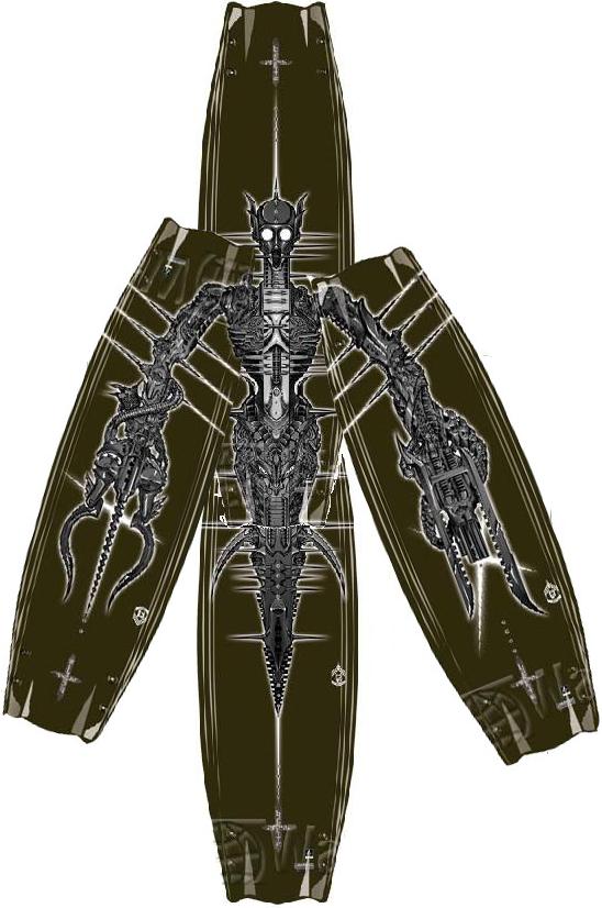
Says something about "Parks Compilation" in a previous post - or somehow I got that... but that's the most extreme example of the design self-indulgence I am talking about, And I don't know if I am talking about a Hyperlite board or a Ronix board, and I spent the last half-hour looking. No clue. What in sam hell is that you guys? I could be getting in trouble with a company I'm on good terms with but even with that being said, and I am being 100% honest, even if I had to say it to Greg Nelson at Hyperlite: (who is a hero of mine) "Don't do that. Seriously don't do that".
Side Note: That 2008 Byerly Legacy, top + base, has to be the dopest graphic set put on a board since the original red LF Squirt.
The 2007 Ronix Frontier is a runner up too. Awesome. Just love the faux-wood boards. Could not be more awesome.
It's too bad that the boards I ride, and the sizes, are never to my liking in terms of graphics - the base is usually fine. I've never had a big problem with any base. Sometimes the top's design so bad that I spraypaint it with flat-black outdrive spraypaint like the big companies do for comps where riders are on "secret next year" boards. That's what they use. Remember the early shots of Chad on a black board? Early Ronix? Yup.
|
|
Join Date: Feb 2011
03-21-2011, 1:36 PM
|
Reply
|
|
i love graphics that span a series of boards, except the best one is never my size..
|
|
Join Date: May 2004
Location: Tyler
03-21-2011, 1:45 PM
|
Reply
|
|
Thats a Hype Parks board from 06 or 07. Designed by Son Duong. Not sure who Son is designing for these days, but I like his style and have several of his prints hanging on my wall. Sure boards have typically been "stand alone" designs, but I think making a series of boards a mural as just another way of being creative. I understand the point of wanting the board to speak for itself without have 3 other boards next to it and I think these designs do that quite well. In addition to creating a bigger picture when arranged together. I'm just one dude, but thats my opinion. And it seems like the trend is fading out.
|
|
Join Date: Feb 2007
03-21-2011, 2:49 PM
|
Reply
|
|
Nacho,
That is the Hyperlite Parks from 2006. It was the same board as he rode in 2005 but with a new graphic on it. It was the last year the Parks shape was carried at Hyperlite. The design, although not as closely as the '05, is a play off of H.R. Giger, a European artist who is the mastermind behind the ALIEN aliens. He has some pretty radical art.
|
|
Join Date: Feb 2007
03-21-2011, 2:52 PM
|
Reply
|
|
Here's about the closest influence for the '06 that I can find. It's an HR Giger print. It's titled "Calavera" i believe.
|
|
Join Date: Feb 2007
03-21-2011, 3:00 PM
|
Reply
|
|
And as far as the 05 goes, you can see the link between this picture and the 44. If you look through Giger's pictures, the similarity is uncanny.
|
|
Join Date: May 2003
03-21-2011, 3:24 PM
|
Reply
|
|
So how is this self indulgent?
|
|
Join Date: Aug 2010
03-22-2011, 9:54 PM
|
Reply
|
Quote:
Originally Posted by jarrod
So how is this self indulgent?
|
Because that dude is a hater... and creativity is the devil.
|
|
Join Date: May 2004
Location: Tyler
03-23-2011, 7:40 AM
|
Reply
|
|
^^lol!!! Sweet, worst case scenario, I find a new artist to enjoy. Let me look around for some of Son's work. Both are great.
|
|
Join Date: May 2004
Location: Tyler
03-23-2011, 7:49 AM
|
Reply
|
|
The similarities are undeniable. I really like this style of work. Some the lines have an almost celtic feel. at any rate, i see your Giger and raise you one Son Duong. He calls it Biotech.
|
|
Join Date: Feb 2007
03-23-2011, 8:44 AM
|
Reply
|
|
Solid! I know Son's been doing work with the Wake industry, and his designs are pretty cool for sure.
I also found this clip, I believe this is the Giger link to the 2005 140 Parks graphic.
|
|
Join Date: May 2004
Location: Tyler
03-23-2011, 9:08 AM
|
Reply
|
|
Giger's detail is unreal.
|
|
Join Date: Feb 2007
03-23-2011, 9:39 AM
|
Reply
|
|
Yeah his stuff is pretty crazy. Takes quite a mind to imagine that stuff up. He definitely pioneered a genre!
|
|
Join Date: May 2008
03-23-2011, 1:56 PM
|
Reply
|
|
I think the 05 and 06 Parks graphics are some of the best I have ever seen. I wish more boards had graphics like that instead of doing the 1980s neon thing that has made a come back.
|
|
Join Date: Jul 2006
03-24-2011, 10:03 AM
|
Reply
|
I was reminded of Byerly's old board (2002) honoring the names of others who passed on the bottom (what names were on the bottom? I think Todd Brendel was one)

I always knew son duong did quite a lot of wake art, but i didn't realize quite the scope... or at least it was nice to remind myself. but while looking at his site i realized that the 2008 catalyst was a nude pic on the bottom... huh. now i will never be able to look at it the same with those "eyes" staring at me.


Last edited by wakerider111; 03-24-2011 at 10:07 AM.
|
|
Join Date: Aug 2010
03-24-2011, 2:06 PM
|
Reply
|
|
woah woah woah.... this is a kid friendly site
|
|
Join Date: Feb 2006
03-25-2011, 12:53 PM
|
Reply
|
|
On the 2010 Ronix Bill board and bindings, someone mentioned the pictures put together that makes out a sentence. One phrase comes out to "Ten pounds of s#it in a five pound bag" and the the other phrase says "Hot for teacher". Pretty cool marketing idea. I like how the board companies are doing that.
|
|
Join Date: Apr 2007
03-25-2011, 2:01 PM
|
Reply
|
|
I feel like this has been a thread before. The mural graphics are pretty cool if done right, I personally like the old subjekt and the bases of the byerly wakeskates.
|
|
Join Date: Feb 2011
03-28-2011, 9:51 PM
|
Reply
|
|
One of the old Hyperlite states (I believe it was the first year it came out) had the initials of a bunch of the riders Mike Ferraro coached. If I remember correctly he was behind most of the design of that board.
Also, the 2011 Slingshot Reflex has a bunch of words, and pictures hidden within the graphic. Some are quite obvious, others are not, but I had a great deal of fun with the graphics on that board. I'm crying just thinking about it!
|
|
Join Date: Feb 2007
03-29-2011, 11:18 AM
|
Reply
|
|
Rob,
I believe in the catalog, they actually called the State a "Mike Ferraro" creation.
|
|


 Linear Mode

