 |
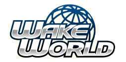
So if we redesign our WakeWorld apparel with a new logo, should we go with "WakeWorld" or "WakeWorld.com" on the shirts? We currently use "WakeWorld.com," but I'm leaning toward dropping the ".com." Let me know your thoughts. Thanks.
|
Drop the ".com" <BR> <BR>I think it would be better to say "WakeWorld" and then under it put, "The Worlds Largest Online Wakeboarding Magazine" or "The Worlds Largest Online Wakeboarding Community". I think there are different ways to say that you have a web-site with out saying ".com" Just my opinion, keep up the good work Dave.
|
I'm gonna say drop the .com too. Just would look better.
|
yeah, drop the ".com", it looks much better
|
How about WAkeWorld in the logo with just a small ".com" below it in the lower right corner? Otherwise, I agree, drop the dot com but find a catchy, clever way to let people know where to find you.
|
Drop the .Com We dont want anyone to know that We are computer geeks.
|
I agree - just the new WW logo without the .com
|
dave, i agree with mark. don't lose the .com altogether - just make it small, maybe a watermark, etc.
|
Oh and how about some colors other than white - say dark blue, grey, etc.?
|
When is my gear going to arrive???<img src="http://www.wakeworld.com/MB/Discus/clipart/biggrin.gif" border=0>
|
Drop ".com". Much better. <BR> <BR>Do a hat with WW in the front and a small wakeworld on the back.
|
Drop the .com, what does the new logo look like?
|
Drop the .com on the larger logo, but have a smaller .com logo somewhere else like the sleeve or front left. And how about some different color got wake? shirts(like white, and maybe red and brown) and maybe some die cut got wake? stickers in different sizes and colors. And have one of those shirts where the logo looks like its been spray painted on<img src="http://www.wakeworld.com/MB/Discus/clipart/lol.gif" border=0>
|
or put the .com vertically up the letter d
|
<BR>David, <BR>Keep the .com! by all means. That's your business. You're runing a business and any exposure you get, the better. <BR>As a business owner in the Wake surf business - you'll loose out by excluding the .com With out the .com your just Wake World dot nothing. <BR>You are Wakeworld.com so keep that on your clothing. The .com will stick in everybodies mind - therefore they will look it up. <BR>Don't loose the .com Dave <BR>
|
have WakeWorld on the front, but in small letters have .com on the back near the top. just an idea
|
Now that I'm seeing other people's opinions, I'm gonna have to switch mine, go ahead and keep the .com on. I like the idea by justin, to have it vertically beside the D!!
|
or under Wake World spell out "DOT COM" in short, fat letters so both lines line up
|
if i wake up early enough to go to class in the mornin i will work on some sketches while i'm there<img src="http://www.wakeworld.com/MB/Discus/clipart/crazy.gif" border=0>
|
Alan has a good point. <BR> <BR>Vertically beside the D sounds like a good idea - maybe in a different color that is less noticable, but recognizable. <BR>
|
<BR>I would keep a discreet .com somewhere near the WakeWorld image. You want to drive more people to your site. Wakeworld could be a magazine or a sports show or something. Either that, or display the url somewhere else on the apparel. I think it's important for you to advertise your website.
|
Drop the .com and incorporate something into the existing round logo (I like that logo).
|
drop the dot com... you dont want people to think your a startup company... hahaha
|
Alan is correct except for the fact that if you don't sell the shirts, no one will see the Wake World regardless of the .com or not. Most people already understand that any legit business will have a website. I am not a big fan of .com on shirts. Too 90's...
|
When is my gear coming?
|
KEEP THE .COM............
|
I like the '.com' vertical beside the 'D' but think it could be cool if the D was backwards so that the '.com' had a solid straight line to snug up against. Others feel free to tell me if thats stupid or not. On a second note I would really like to get a WakeWorld <u>decal</u>, not sticker, in white for my board. Like say 10" long by 2-3" tall. On the sticker I wouldn't mind the 'www' or the '.com' and it would be nice if it was italiciced(cant spell) or in some Old English style font. Just the kinda think i'm personally looking for.
|
How about having a really huge ".com" and then a small wakeworld. <BR> <BR>Nah, maybe not. I just thought I'd throw something different. <BR> <BR>When I wear my wakeworld shirt (which has become my regular v-ball shirt btw) I am glad that I can advertise your site as being an online site. The ".com" needs to stay IMO. <BR> <BR>Thanks for the great site. I enjoyed the new article about mastercraft. <BR> <BR>Ross
|
Dave, the only way you're going to satisfy these people is if you one design with one without. <BR>Personally I like the idea of a small .com
|
I like Mark's idea, having the small ".com" in the corner. But deffinately make "WakeWorld" the focus of the logo.
|
Keep the .com, more exposure. Some people may not know what WW is.
|
Or drop the .com on the front and on the sleeve print <a href="http://www.wakeworld.com" target="_blank">www.wakeworld.com</a> kind of like how you did it on the "Got Wake?" shirts, I like that format a lot. I'm not a fan of the big .com on the white t-shirts tho. Also if you could incorporate a silhoutte of a wakeboarder into the logo that would be sick, so for people who don't know what wakeboarding is they can get a visual and be directed to a place where they can check it out. Or even a picture, cause if people see a picture of wakeboarding on a shirt it could stimulate curiousity and get them wanting to check it out and if you make <a href="http://www.wakeworld.com" target="_blank">www.wakeworld.com</a> visually available then it will help dirve them to your site. For example the Ridin High Sweatshirts. They've got wake pics on them and below the design there is the website. Just my .02
|
I would buy a hoodie with either logo if it came in any color besides white.
|
I am ok either way with the .com. Guess it depends on the logo design. I agree on the silhouette as part of the new logo. Lets see some ideas and get some feedback on logo designs. Getting support for new WW gear should not be a problem. <BR> <BR>I dont do the white ts or hoodies
. they get dirty too fast. More colors would be great. Hoodies (no white) Gray, Blue, Black, Red. Check with Viking extreme to see who they use as a vendor for hoodies
. Solid product and they feel like fleece on the inside. Good stuff. Yes to colored ts too. <BR>
|
i would def buy a hoodie if it was dark blue with white writing and even better if its a zip-up
|
Drop the .com. See Dave, executive decision, I deserve a promotion. <IMG SRC="http://www.wakeworld.com/MB/Discus/clipart/happy.gif" ALT=":-)" BORDER=0> Just kidding!
|
When should I expect my WW gear? <BR> <BR>Lose the .com.
|
The .com is where the business comes from. <BR>Any wake boarder will know that this is not a start-up company - and that is our market place . Keep the .com cause that's what you are. The goal here is to spread the site. And with out the .com people who never visted the site will gain knowledge about what is going on here, when they visit the site - because there is a .com. In return you may get more advertising, and members. There is not even a question about this thread - in my opinion. .com - include it! <BR>And there is no other site like this one.
|
Wow, thanks for all the responses. I didn't count them, but I think the "lose the .com" voice was the loudest. <BR> <BR>I'm not as concerned with the advertising aspect as I am about making sure it's a good looking shirt that people will want to wear often. I've got a lot of wakeboard related shirts in my closet that never see the light of day and I don't want our shirts to have that problem. <BR> <BR>We are definitely ditching the white shirts when we run out of our current inventory. The new versions will have two colors for shirts, hoodies, tanks, etc. We wanted to do one dark color and one light color. The dark will be a Navy blue with a white logo and the light will be a light gray (not ash) with a dark blue logo.
|
grey, make it in grey
|
| All times are GMT -7. The time now is 4:26 AM. |